Blog / Ecommerce
EcommerceCheckouts that don’t feel like a tax return
The abandoned cart isn’t a customer problem — it’s a design problem. Let’s fix the leaky bit.
 Damian Way — Ohmania29 Apr 2026 · 7 min read
Roughly seven in ten online carts get abandoned. That number is so well-worn it’s become an excuse. Store owners shrug, blame fickle shoppers, and pour more money into ads to refill a bucket with a hole in it.
Here’s the reframe that changes everything. Most abandonment isn’t customers being flaky. It’s customers being interrupted. They wanted the thing, added it to the basket, started checking out, and then the checkout itself talked them out of it. Surprise fees. A demand to create an account. A form longer than a mortgage application. Each one a small reason to think “actually, not now.”
Some of that 70% were never going to buy, and that’s fine. But a meaningful chunk were ready buyers you lost at the last step, which is the most expensive place to lose anyone. You’d already done the hard part. Then the checkout undid it.
Most abandoned carts aren’t lost customers. They’re customers you had, right up until the moment your checkout gave them a reason to leave.
The reframe
It’s not them, it’s the checkout
Separate two groups in your head. The browsers comparing prices and saving for later will always abandon, and no amount of optimisation changes that, nor should it. The group that matters is the one with intent: card half out, ready to pay, then stopped by something on your page.
That second group is recoverable revenue sitting in plain sight. And the reasons they leave are not mysterious. They’ve been studied to death, they’re remarkably consistent across every store, and almost all of them are design decisions you can reverse. Which means abandonment isn’t a fact of life to accept. It’s a list of fixable leaks. Here are the six that drain the most.
Fix 01 / Surprise costs
Show the full price before the last screen
The single biggest reason people bail is being ambushed by cost at the end. Shipping, tax, handling, a mystery fee that appears on the final screen after they’ve mentally committed to a number. It feels like a bait and switch, even when it isn’t, and it sends people straight back out.
Fix it by being honest early. Show shipping costs, or a clear estimate, before the final step. Put the running total somewhere visible the whole way through. If you offer free shipping over a threshold, say so loudly, because “spend £8 more for free delivery” is a nudge up, not a reason to leave. No one likes surprises at the till.
Every extra field is a tiny invitation to reconsider. At checkout, doubt is expensive.
Fix 02 / Forced accounts
Let them check out as a guest
Forcing someone to create an account before they can pay is one of the most reliable ways to lose a first-time buyer. They came to buy a product, not to start a relationship and remember another password. The account wall is friction dressed up as a feature.
Offer guest checkout, full stop. You can invite them to save their details after the order is placed, when the pressure is off and they’re happy. Most will say yes once they’ve had a good experience. Demand it upfront and a chunk of them just close the tab.
Fix 03 / Friction
Cut the form to the bone
Every field you ask for is a small tax on completion, and a moment where someone can reconsider. Yet most checkouts ask for things they don’t need, repeat questions, and split it across more steps than the order warrants.
Strip it back to what’s genuinely required to fulfil the order. Use address autocomplete so a postcode does the work of five fields. Don’t ask for billing and shipping separately when they’re usually the same, default them to match with a tick to change it. Show clear progress if it’s multi-step. Validate inline so an error flags the moment it happens, and never wipe a filled-in form because of one mistake. That single behaviour loses sales that were already won.
Fix 04 / Payment options
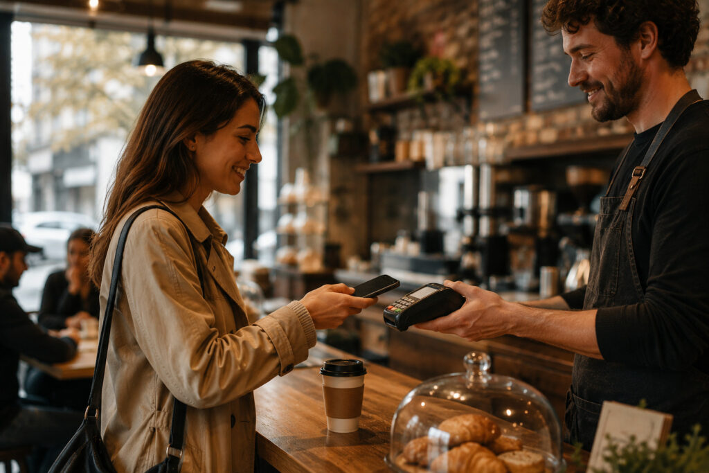
Meet people where their money already is
If someone’s preferred way to pay isn’t there, a portion of them won’t hunt for a workaround. They’ll leave. And on mobile, typing a sixteen-digit card number with thumbs is its own little barrier.
Offer the wallets people already use, Apple Pay and Google Pay, plus the express options that let a returning buyer pay in two taps without typing anything. Express checkout is one of the highest-impact changes you can make on mobile, because it collapses the entire form into a fingerprint. The easier you make paying, the more people finish.
Fix 05 / Trust
Reassure at the exact moment of doubt
The payment step is where nerves peak. People are about to hand over card details, and any wobble in confidence costs you the sale. A checkout that suddenly looks different from the rest of the site, redirects somewhere unfamiliar, or feels even slightly off plants exactly the wrong seed.
Keep the checkout visually consistent with your brand so it never feels like they’ve been bounced to a sketchy third party. Show the security signals quietly but clearly. Make the returns and refund position easy to find right there, because “what if it’s wrong?” is a real question people answer before paying, not after. Confidence at this step is worth more than any discount.
Fix 06 / Mobile
Build the checkout for thumbs, not mouse pointers
Most of your traffic is on a phone, and the checkout is where mobile design quietly falls apart. Tap targets too small. The wrong keyboard appearing, so a number field shows letters. Buttons hidden below the fold. A total you have to scroll to find.
Test the whole flow on an actual phone, on a real connection, not just a narrow browser window on your desktop. Use the correct input types so the number pad shows up for card and phone fields. Make buttons big and obvious. And keep it fast, because every laggy step at checkout is a fresh chance for someone to give up. A checkout that’s a pleasure on mobile is a genuine competitive edge, because so many still aren’t.
The backstop
Recovery emails bail water, they don’t patch the hole
Abandoned cart emails work, and you should run them. A well-timed, friendly nudge recovers a real slice of lost orders, and it’s close to free money once it’s set up.
But be clear about what it is. Recovery is a backstop for a checkout that’s already leaking. If you’re relying on follow-up emails to claw back sales your own checkout chased away, you’re treating the symptom and paying for the privilege. Fix the flow first, then let recovery emails catch the genuine “got distracted, forgot” cases they’re actually good at. Patch the hole, then bail the water that’s left.
Bottom line
The cheapest growth you’ll find
Improving your checkout is the rare lever that doesn’t cost you a penny more in traffic. Same visitors, same ad spend, same products. You’re simply keeping the buyers you already earned instead of losing them at the door.
That makes checkout optimisation some of the highest-return work in ecommerce, and most stores leave it untouched because the checkout “works.” Working isn’t the bar. Finishing is. If yours feels like a tax return, that’s not your customers’ fault, and it’s entirely fixable.
Bleeding sales at the last step? Tell us what you’re selling. We’ll find the leaks and tell you which ones are worth fixing first, in plain English.